Application development
Getting involved with Plasma Mobile application environment is a perfect opportunity to familiarize with a set of important technologies:
Qt, the cross-platform application framework for creating applications that run on various software and hardware platforms with little or no change in the underlying codebase
QML, the UI specification and programming language that allows designers and developers to create applications with fluid transitions and effects, which are quite popular in mobile devices. QML is a declarative language offering a highly readable, declarative, JSON-like syntax with support for imperative JavaScript expressions.
Qt Quick, the standard library of types and functionality for QML. It includes, among many others, visual types, interactive types, animations, models and views. A QML application developer can get access this functionality with a single import statement.
CMake, the cross-platform set of tools designed to build, test and package software, using a compiler-independent method.
Kirigami, a set of QtQuick components, facilitating the easy creation of applications that look and feel great on mobile as well as on desktop devices, following the KDE Human Interface Guidelines.
Documentation resources
In this section you will find a set of technical resources that will accompany you during your journey as a Plasma Mobile developer. If you are just starting out with Qt, QML and CMake, you will find here enough detail so as to feel comfortable with the technologies related to Plasma Mobile development. If you are an experienced Qt developer, you can find here valuable resources so as to comply with best practices.
QtQuick and QML
Create the application template
We will use the KDE flatpak SDK to develop and package the app, so all that is required is a working flatpak and flatpak-builder installation.
To install flatpak on your workstation, follow the official instructions provided here.
Tip
Before starting, please ensure that your system is already set up as described here.
First, clone the app template:
git clone https://invent.kde.org/jbbgameich/plasma-mobile-app-template.git
This repository can be used as a template to develop Plasma Mobile applications. It already includes templates for the qml ui, a c++ part, app metadata and flatpak packaging.
Build the application locally
# Install the SDK
flatpak install flathub org.kde.Sdk//5.12 # Only needs to be done once

# Build
flatpak-builder flatpak-build-desktop --force-clean --ccache *.json

# Start
export QT_QUICK_CONTROLS_MOBILE=true QT_QUICK_CONTROLS_STYLE=Plasma # Required for making the application look like started on a phone
flatpak-builder --run flatpak-build-desktop *.json hellokirigami
If you can see this image:
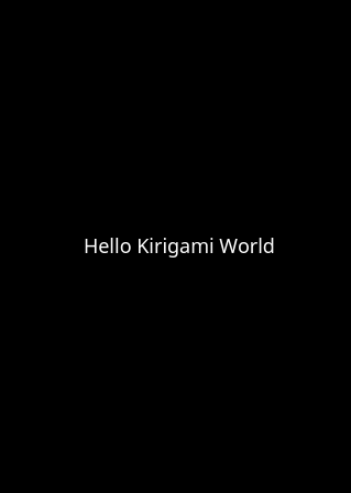
Hellokirigami.png
you have successfully created your first Plasma Mobile application!
Build the application for the phone
Make sure your system supports qemu user emulation. If not, you can find help for example here.
flatpak install flathub org.kde.Sdk/arm/5.12 # Only needs to be done once
flatpak-builder flatpak-build-phone --repo=arm-phone --arch=arm --force-clean --ccache *.json
flatpak build-bundle arm-phone hellokirigami.flatpak org.kde.hellokirigami --arch=arm
Now your app is exported into app.flatpak. You can copy the file to the phone using scp:
scp app.flatpak phablet@10.15.19.82:/home/phablet/app.flatpak
ssh phablet@10.15.19.82
flatpak install app.flatpak
Your new application should now appear on the homescreen.
Customize the application template
Edit the files to fit your naming and needs. In each command, replace “io.you.newapp” and “newapp” with the id and name you want to use.
sed -i 's/org.kde.hellokirigami/org.kde.kirigami-tutorial/g;s/[Hh]ello[Kk]irigami/kirigami-tutorial/g' $(find . -name "CMakeLists.txt" -or -name "*.desktop" -or -name "*.xml" -or -name "*.json"  -or -name *.cpp)

for file in $(find . -name "org.kde.hellokirigami*"); do mv $file $(echo $file | sed 's/org.kde.hellokirigami/io.you.newapp/g'); done
Upload application to repository
Once your application is working and is usable, you can submit a patch to include it into the KDE flatpak repository.
After setting up git with the recommended KDE settings, you can create a new file io.you.newapp.remoteapp in the flatpak-kde-applications repository.
git clone kde:flatpak-kde-applications && cd flatpak-kde-applications
Paste the following content into the file:
ID=io.you.newapp
JSON=io.you.newapp.json
GITURL=https://gitlab.com/you/newapp.git
You can now submit the patch on Phabricator. Once accepted, your app will be automatically built, published and made available in Discover (if the KDE flatpak repository is enabled on the device).
Create a Kirigami application
In this tutorial we will use some of the technologies already presented in the application development section. Before starting, you should follow the instructions in that page since the hellokirigami prototype will be used as a skeleton for our development.
Rename the prototype
At first, we will change the name used in the plasma-mobile-app-template from hellokirigami to kirigami-tutorial:
sed -i 's/org.kde.hellokirigami/org.kde.kirigami-tutorial/g;s/[Hh]ello[Kk]irigami/kirigami-tutorial/g' $(find . -name "CMakeLists.txt" -or -name "*.desktop" -or -name "*.xml" -or -name "*.json"  -or -name *.cpp)

for file in $(find . -name "org.kde.hellokirigami*"); do mv $file $(echo $file | sed 's/org.kde.hellokirigami/org.kde.kirigami-tutorial/g'); done
Objective
Our goal is to create a simple prototype of an address book. We need to display a grid of cards that will show the contacts of our phone. Each card should display the name of the contact, her/his mobile phone and the email address.
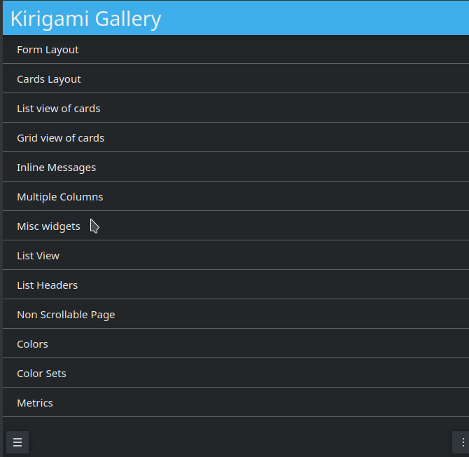
Kirigami Gallery
Now that the requirements of our project have been defined we need to find out the technologies that will help us to create the prototype. In this task Kirigami Gallery will be our friend. Kirigami Gallery is an application which uses the features of Kirigami, provides links to the source code, tips on how to use the components as well as links to the corresponding HIG pages.
Tip
Before continuing please install Kirigami Gallery. It should already be in the repository of your GNU Linux distribution.
Find a card grid
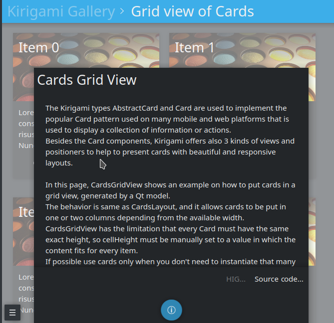
Navigating through the Kirigami Gallery application, we will stumble upon the “Grid view of cards” gallery component. This is a good candidate that serves our purpose; to display a grid of contact cards.
List of kirigami gallery components
After selecting the “Grid view of cards” gallery component, we will click to the bottom action and we will get some useful information about the Card and Abstract Card types.
Kirigami gallery grid view
In this information dialog we will also find a link to the source code of the Cards Grid View. Let’s navigate to this page.
Implement the card grid
We will reuse the most of the code found in the Cards Grid View Gallery source code page. In particular, we will remove the extra parts of the OverlaySheet (which is the implementation of the Kirigami Gallery that helped us reach the kirigami-gallery source code repository).
So, we are going to substitute the Page component of main.qml of the skeleton app with the below Scrollable Page:
Kirigami.ScrollablePage {

    title: "Address book (prototype)"

    Kirigami.CardsGridView {
        id: view

        model: ListModel {
            id: mainModel
        }

        delegate: card
    }
}
What we have done so far is to create a ScrollablePage and put into it a CardsGridView, since we want to display a grid of Cards generated from a model. The data of each contact is provided by a ListModel while the card delegate is responsible for the presentation of the data. For more info about models and views in Qt Quick, see here.
Now let’s populate the model that will feed our grid view with data. In Kirigami.ScrollablePage definition, just after:
  delegate: card
}
add the below:
Component.onCompleted: {
    mainModel.append({"firstname": "Pablo", "lastname": "Doe", "cellphone": "6300000002", "email" : "jane-doe@example.com", "photo": "qrc:/konqi.jpg"});
    mainModel.append({"firstname": "Paul", "lastname": "Adams", "cellphone": "6300000003", "email" : "paul-adams@example.com", "photo": "qrc:/katie.jpg"});
    mainModel.append({"firstname": "John", "lastname": "Doe", "cellphone": "6300000001", "email" : "john-doe@example.com", "photo": "qrc:/konqi.jpg"});
    mainModel.append({"firstname": "Ken", "lastname": "Brown", "cellphone": "6300000004", "email" : "ken-brown@example.com", "photo": "qrc:/konqi.jpg"});
    mainModel.append({"firstname": "Al", "lastname": "Anderson", "cellphone": "6300000005", "email" : "al-anderson@example.com", "photo": "qrc:/katie.jpg"});
    mainModel.append({"firstname": "Kate", "lastname": "Adams", "cellphone": "6300000005", "email" : "kate-adams@example.com", "photo": "qrc:/konqi.jpg"});
}
The model part of our implementation is ready. Let’s proceed to defining a delegate that will be responsible for displaying the data. So, we add the below code to the main.qml page, just after the Component.onCompleted definition:
Component {
    id: card

    Kirigami.Card {

        height: view.cellHeight - Kirigami.Units.largeSpacing

        banner {
            title: model.firstname + " " + model.lastname
            titleIcon: "im-user"
        }

        contentItem: Column {
            id: content

            spacing: Kirigami.Units.smallSpacing

            Controls.Label {
                wrapMode: Text.WordWrap
                text: "Mobile: " + model.cellphone
            }

            Controls.Label {
                wrapMode: Text.WordWrap
                text: "Email: " + model.email
            }
        }
    }
}
Following the relative information in the api page we populate a “banner” (although without an image yet), that will act as a header that will display the name of the contact as well as a contact icon.
The main content of the card has been populated with the cell phone number and the email of the contact, structured as a column of labels.
The application should look like this:
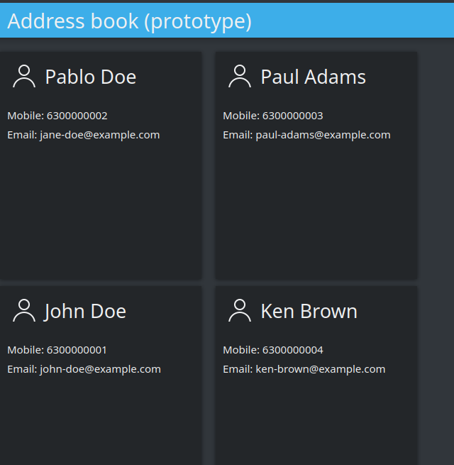
Simple grid of cards
Tip
You can find the full source code of the tutorial at invent.kde.org.
As a last step we will add some dummy functionality to each card. In particular, a “call” action will be added. Nevertheless, instead of a real call, a passive notification will be displayed. So, let’s change the card Component to the below:
Component {
    id: card

    Kirigami.Card {

        height: view.cellHeight - Kirigami.Units.largeSpacing

        banner {
            title: model.firstname + " " + model.lastname
            titleIcon: "im-user"
        }

        contentItem: Column {
            id: content

            spacing: Kirigami.Units.smallSpacing

            Controls.Label {
                wrapMode: Text.WordWrap
                text: "Mobile: " + model.cellphone
            }

            Controls.Label {
                wrapMode: Text.WordWrap
                text: "Email: " + model.email
            }
        }

        actions: [
            Kirigami.Action {
                text: "Call"
                icon.name: "call-start"

                onTriggered: { showPassiveNotification("Calling " + model.firstname + " " + model.lastname + " ...") }
            }
        ]
    }
}
So, we added an action that, as soon as it is triggered (by pressing the action button), a passive notification is displayed.
Finally, our application should look like this:
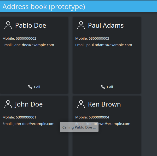
Grid with calling action triggered